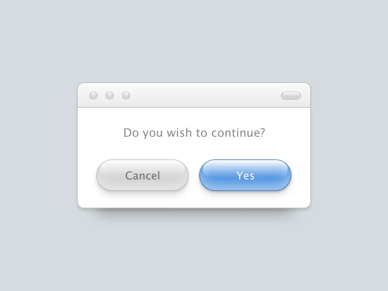
Aqua UI CSS Buttons
2016-06-28
Though it may feel like nostalgia, the old OS design for Mac was arguably better than the current iteration (as of this writing - High Sierra). I recently designed a quick Dribbble shot showcasing how the older operating system used to have so much more character and depth.

My initial Dribbble shot, which can be found here
Since I’ve been wanting to dip my toes into more tutorial-based articles (maybe I’ll even do some screencasts in the future), I decided to start out simple. Let’s walk through how to implement these ‘aqua’ UI buttons with pure CSS.
Starting with a basic foundation
Since this project consists of only two buttons elements, the HTML or skeleton of this project is very straightforward:
<button class="cancel">Cancel</button>
<button class="confirm">Confirm</button>
Styling the buttons
The first step is to remove the browser’s default button styling by using the appearance property. This will help avoid having to fight against the browser and minimize our CSS code.
button {
  -webkit-appearance: none;
  -moz-appearance: none;
}
Next, we apply a fairly simple set of CSS that will be shared across both the confirm and cancel buttons:
(Pay attention to the transition property as we will be returning to that shortly)
button {
  -webkit-appearance: none;
  -moz-appearance: none;
  border: 1px solid #ccc;
  border-radius: 125px;
  box-shadow: inset 0 13px 25px rgba(255,255,255,0.5), 0 3px 5px rgba(0,0,0,0.2), 0 10px 13px rgba(0,0,0,0.1);
  cursor: pointer;
  font-family: 'Lucida Grande', Helvetica, Arial, sans-serif;
  font-size: 2rem;
  margin: 5rem 1rem;
  padding: 1.2rem 4rem;
  position: relative;
  transition: all ease .3s;
}
Then we separate the specific confirm and cancel button styles into their own class selectors:
button.confirm {
  background: #4A90E2;
  border-color: #3672B6;
  color: #fff;
}

button.cancel {
  background: #D0D0D0;
  border-color: #B8B8B8;
  color: #6F6F6F;
}
Playing with pseudo elements
Now that the button is styled and structured with basic formatting, it’s time to add that classic ‘shine’ seen in the original Dribbble shot.
The cleanest way to do this is by using the :before pseudo element paired with a linear-gradient background.
button:before {
  background: linear-gradient(rgba(255,255,255,1) 0%, rgba(255,255,255,0) 100%);
  border-radius: 125px;
  content:'';
  height: 50px;
  left: 4%;
  position: absolute;
  top: 1px;
  transition: all ease .3s;
  width: 92%;
}
Adding interaction
The final step is adding the user hover interaction: (Remember that transition property?)
button:hover {
  box-shadow: inset 0 13px 25px rgba(255,255,255,0.8), 0 3px 5px rgba(0,0,0,0.2), 0 10px 13px rgba(0,0,0,0.2);
  transform: scale(1.02);
}
That’s it!
See it live on CodePen
You can view this project on CodePen here.
Feel free to fork it or implement your own!