Cut Your Forms in Half
2019-05-09
Building web forms can sometimes feel like a boring or daunting task. Don’t pass this dread on to your users - rip out as many of your form fields as possible.
Web forms tend to get a bad rep, mainly because so many horrible design choices are made without the user experience set at the forefront. Often times clients demand that they need those twenty input fields or else how will they collect critical information from their users? Normally when I’m approached with such a statement I simply ask them:
“How many form fields would you be willing to fill out for an emergency situation?”
“My form isn’t for emergencies though”, they might reply. In that case ask them why they feel it acceptable to waste their users’ time just because it isn’t urgent. Time is valuable.
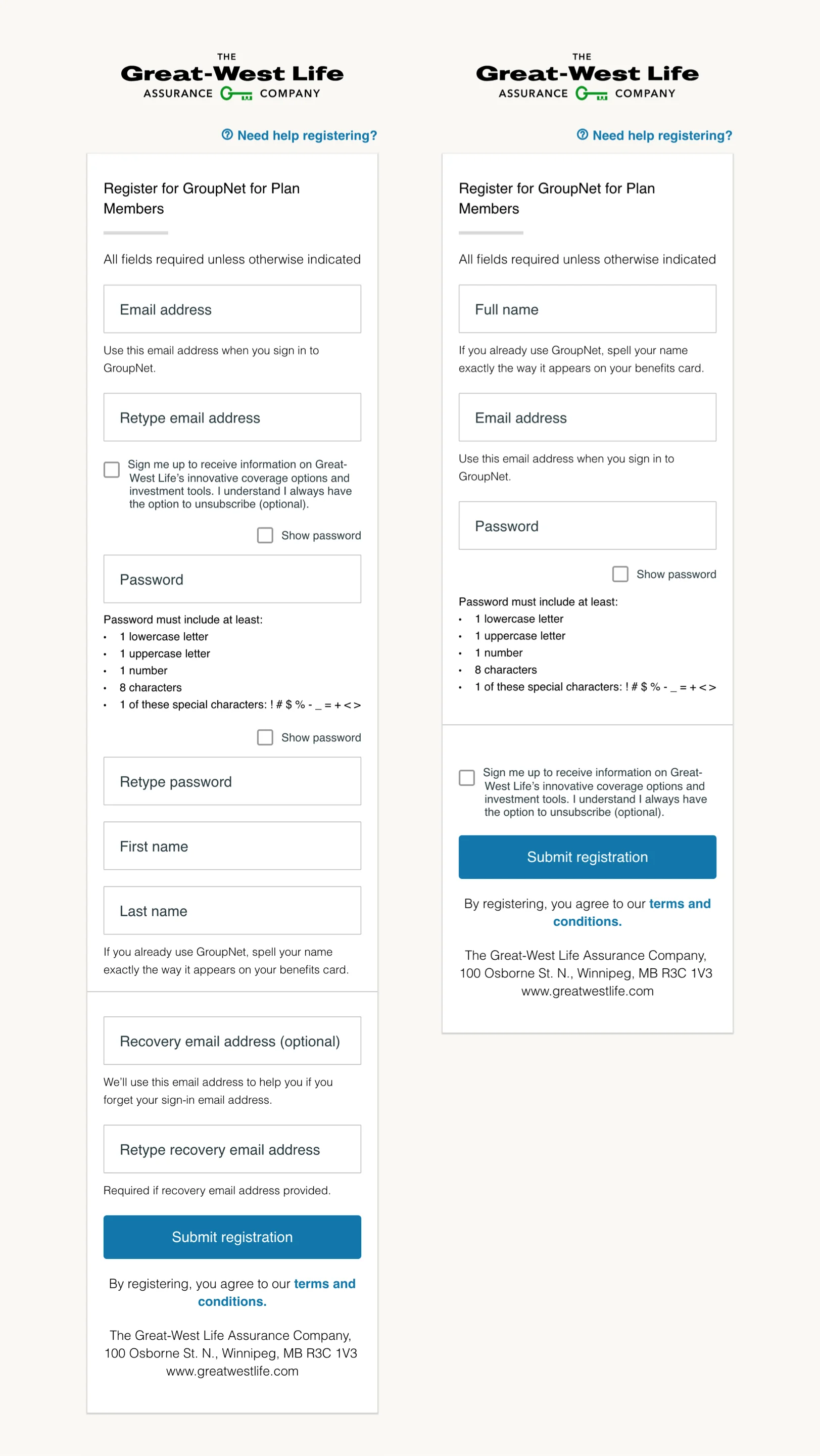
Fixing a form in the wild
Let’s use a real-world form off the Great West Life Insurance website as an example (left is original, right is updated):
Breaking things down
So what exactly have we changed?
- Combined first and last name fields into a single input
- Removed the overkill “retype” email & password field (with the optional
show passwordthis becomes redundant) - Minor position changes for optional subscription sign up and input field descriptions
- Removed
recovery email- This is something that should be prompted to the user after successful registration - don’t bog them down before they even sign up
Helpful Micro improvements
You don’t need to be extreme when gutting form fields - just be practical.
- Don’t use “first” and “last” names as separate inputs, instead use something like “Full Name”
- Make complex questions use preset answers via
checkboxorradioinputs - Avoid
selectitems whenever possible (these are clunky and most times unnecessary) - Include easy to understand, real-time error prompts
Further reading
- Great place to deep-dive into UX form design: UX Movement