The Death of Personality
2017-11-01
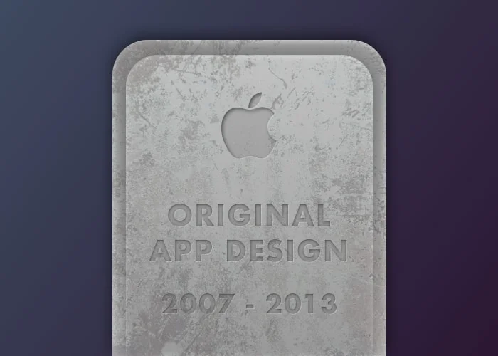
On September 18, 2013 truly original product design (everything from icon and app design to UI and experience interactions) began it’s fast decline into the abyss with the release of Apple’s iOS 7 update. It was called revolutionary. It was seen as a ‘new age’ of design. I think it was a big mistake.
Stepping backwards
Let me start off by saying I understand where they were trying to take mobile app design as a whole. “Less is more”, “cleaner UI to let the content be the focus”, “more touch based interactions”. The problem is that they cranked the dial too far in the other direction.
Because of this, a large movement was created based around the idea that skeuomorphic design is garbage, flat design is the future. And everyone drank the kool-aid without a single objection. I’m using this ironically.
Icons with no identity
Do you remember Instagram’s original app icon and UI? Do you remember how everyone initially praised it? Show those old designs to the same designers who loved it only a few years ago, and they will now laugh at how “bad” it is.
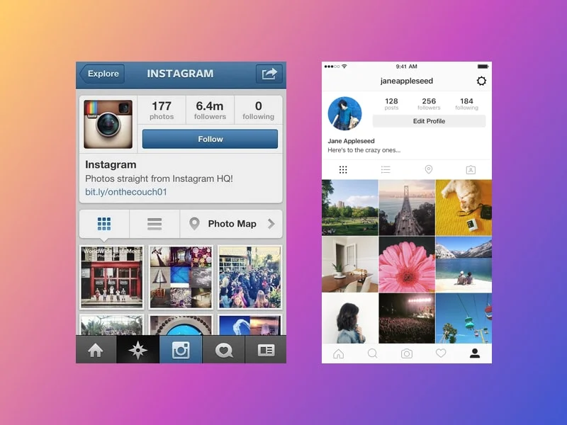
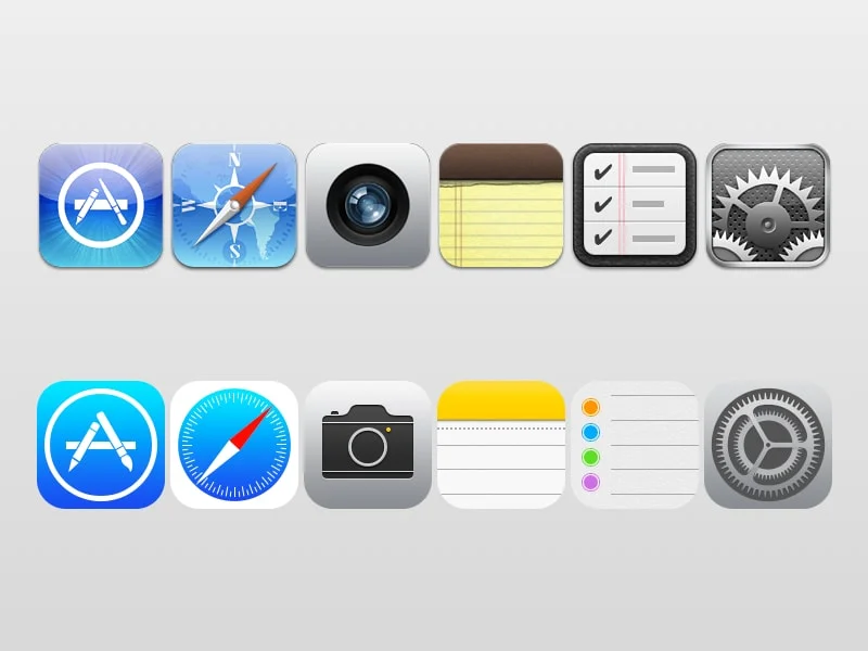
Unfortunately the same can be said for Apple’s system icons across both iOS and macOS.
I believe Apple took the concept of a ‘consistent’ design system across their iconography too literally. All the system icons should compliment one another, but they shouldn’t lose their own individual look and feel.
Lackluster UI
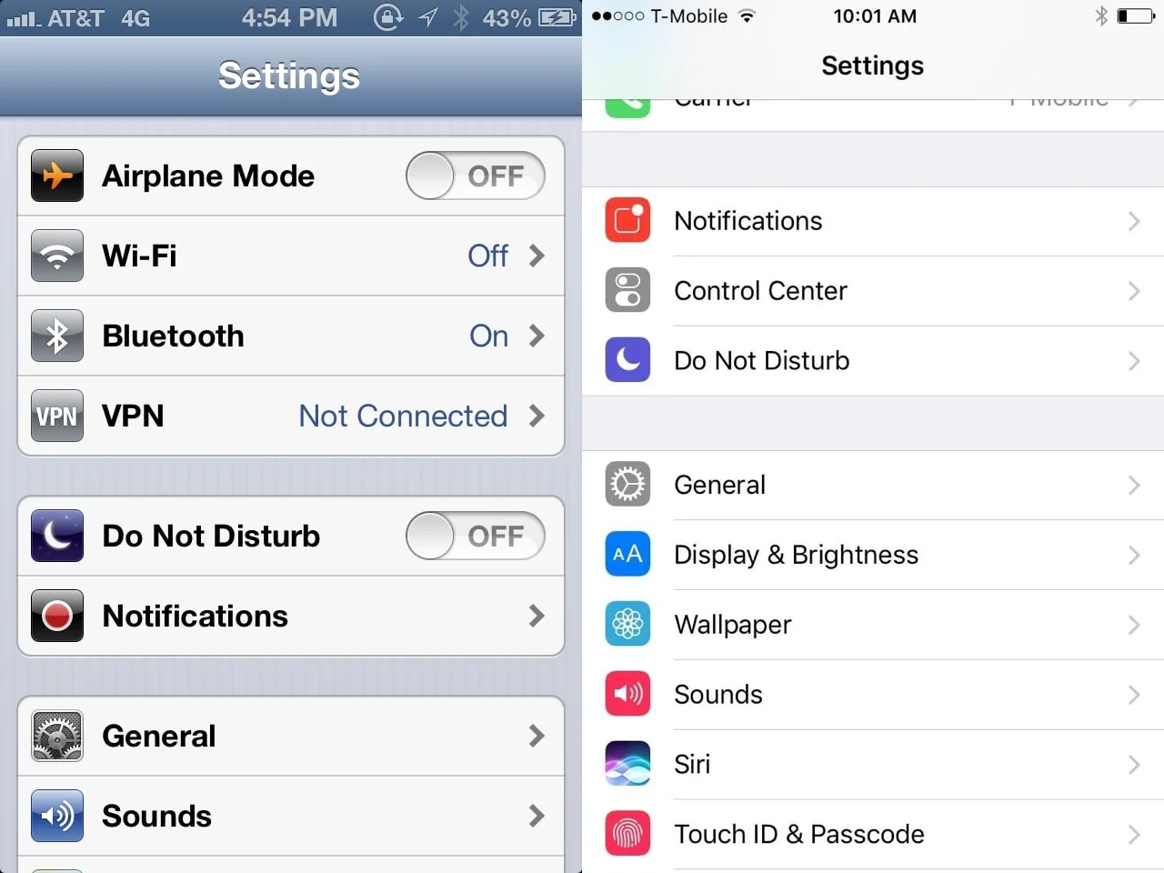
The once inspiring and hierarchically consistent interface of both iOS and macOS was also quickly swatted away. In it’s place we as users saw the removal of depth, initial visual cues as to what was interactive and what was static, and sadly even the overall color was muted.
Impact on the web
This may not have been a bad thing if it was self-contained to Apple itself. The problem is that Apple has such a huge influence on the design industry - although that is starting to diminish, due to disasters like the iPhone X - that everyone starts to mimic and copy their style. This includes designers of sites and progressive web apps.
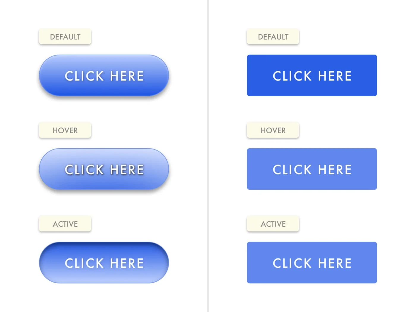
With the evolution of websites morphing into progressive web apps, designers have felt the need to start implementing this bland style for their design systems.
What we got in return:
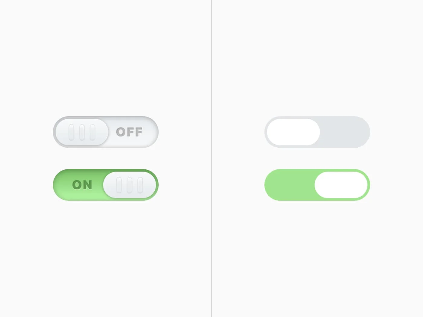
- washed out colors
- zero gradients for depth
- the removal of all drop shadows (in meaningful ways that is)
- the same generic Helvetica-based typefaces
- the absence of hover states on interactive elements
- a lack of any proper information density
- an overkill of whitespace
- one dimensional buttons (you know, the thing you want the user to interact with)
- a complete disregard for original design not based off every other popular product
Breaking free of the ‘modern era’
Thankfully, there are still a few good designers who continue to create original and inspiring work not based solely on current trends.
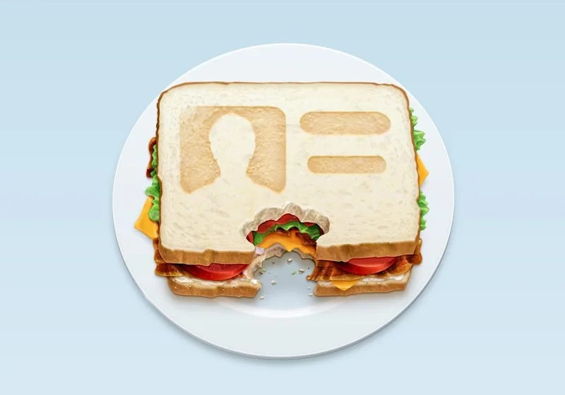
Flexibits recently launched a new contact app for macOS called Cardhop. While the UI still shifts a little too far to the ‘flat trend’ for my liking, they thankfully hired the very talented David Lanham to design the beautiful application icon.
This is where visual design shines. Icon designs like Cardhop’s are what allow individual applications to stand out in the dock or mobile home-screen among all the others. So how is that not UX design?
The current trendy thought process from designers that “visual design doesn’t involve UX design” is garbage. Neither are mutually exclusive and I think anyone who believes so is being incredibly short-sighted.
If you’re a designer, please stop riding trends and make your work visually beautiful. That doesn’t mean you need to sacrifice usability or function, but just put more love and confidence into your profession. Companies like Apple and Google don’t control how everyone else’s apps and sites should look, and based on their current design decisions - they shouldn’t.