Easy Toggle Switches
2019-02-18
Sometimes there is a need to use toggle elements in-place of the default checkbox inputs. The problem is, I tend to see a lot of developers reaching for plugins or JavaScript components in order to implement these toggles.
This is overkill. You can create your own custom input elements to mimic toggles perfectly with just a small amount of CSS.
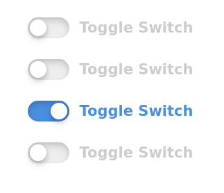
What we will be building

The HTML
The build structure for these toggles is really simple, we only need:
- a parent container to hold all our corresponding elements
- a checkbox
inputelement (which we will hide) - an empty label designed to represent the slider
-
a text label that references the
input/* Main toggle parent container */
/* Checkbox input, hidden with CSS */ /* The toggle slider element */ /* The text label to the right of the slider */
And that’s everything we need for the HTML.
ProTip: Don’t forget to increment both the id and for attributes when adding additional toggles. This seems like a no-brainer but it’s overlooked more than you think.
The CSS
To get things started we will add the styling to the .toggle-switch item directly (using flexbox in this demo for easier layout).
Sidenote: You will notice the inclusion of CSS variables in this demo - if you are unfamiliar with how to use root variables in CSS, take a look at one of my previous posts: CSS variables.
:root {
    --primary-color: #4A90E2;
}

.toggle-switch {
    align-items: center;
    display: flex;
    font-size: 14px;
    justify-content: center;
    margin: 20px 0;
}
Next we will hide the default browser checkbox element since we won’t be needing it:
.toggle-input {
    position: absolute;
    visibility: hidden;
    z-index: -1;
}
Let’s also add some base styling for the label containing the text corresponding to it’s input sibling:
.toggle-label {
    color: #ccc;
    cursor: pointer;
    font-weight: bold;
    padding-left: 10px;
    text-shadow: 1px 1px 0 rgba(255,255,255,0.3);
    transition: ease all .3s;
}
Now we target the .toggle-slider label and add the styling for the main slider base:
/* This is just the main slider base */
.toggle-slider {
    background: #eee;
    border-radius: 9999px;
    box-shadow: inset 0 2px 4px rgba(0,0,0,0.1),
                inset 0 4px 8px rgba(0,0,0,0.1),
                0 1px 1px rgba(255,255,255,1);
    cursor: pointer;
    display: inline-block;
    height: 20px;
    position: relative;
    transition: all ease .3s;
    width: 40px;
}
We could include a separate element for the circle toggle switcher itself, but instead we will use the :before pseudo element:
.toggle-slider:before {
    background: white;
    border-radius: 9999px;
    box-shadow: 0 4px 8px rgba(0,0,0,0.1),
                0 2px 4px rgba(0,0,0,0.2);
    content:'';
    height: 16px;
    left: 2px;
    position: absolute;
    top: 2px;
    transition: all ease .3s;
    width: 16px;
}
Interaction
Right now we just have a static toggle that does nothing when the user interacts with it. Let’s change that by moving the pseudo element’s position based on the checkbox input state and updating the label text color:
.toggle-input:checked + .toggle-slider {
    background: var(--primary-color);
}
.toggle-input:checked + .toggle-slider:before {
    /* Move 100% of the width minus it's own width plus initial 'left' */
    left: calc(100% - 18px);
}

.toggle-input:checked ~ .toggle-label {
    color: var(--primary-color);
}
And because we already included the transition property on both the base slider and label text, everything animates nicely between state changes.
Final code
To make things easier, you can find the HTML & CSS is their entirety below:
HTML
<div class="toggle-switch">
    <input class="toggle-input" type="checkbox" id="toggle-1">
    <label class="toggle-slider" for="toggle-1"></label>
    <label class="toggle-label" for="toggle-1">Toggle Switch</label>
</div>
<div class="toggle-switch">
    <input class="toggle-input" type="checkbox" id="toggle-2">
    <label class="toggle-slider" for="toggle-2"></label>
    <label class="toggle-label" for="toggle-2">Toggle Switch</label>
</div>
<div class="toggle-switch">
    <input class="toggle-input" type="checkbox" id="toggle-3" checked>
    <label class="toggle-slider" for="toggle-3"></label>
    <label class="toggle-label" for="toggle-3">Toggle Switch</label>
</div>
<div class="toggle-switch">
    <input class="toggle-input" type="checkbox" id="toggle-4">
    <label class="toggle-slider" for="toggle-4"></label>
    <label class="toggle-label" for="toggle-4">Toggle Switch</label>
</div>
The CSS
:root {
    --primary-color: #4A90E2;
}
.toggle-switch {
    align-items: center;
    display: flex;
    font-size: 14px;
    justify-content: center;
    margin: 20px 0;
}
.toggle-input {
    position: absolute;
    visibility: hidden;
    z-index: -1;
}
.toggle-slider {
    background: #eee;
    border-radius: 9999px;
    box-shadow: inset 0 2px 4px rgba(0,0,0,0.1),
                inset 0 4px 8px rgba(0,0,0,0.1),
                0 1px 1px rgba(255,255,255,1);
    cursor: pointer;
    display: inline-block;
    height: 20px;
    position: relative;
    transition: all ease .3s;
    width: 40px;
}
.toggle-slider:before {
    background: white;
    border-radius: 9999px;
    box-shadow: 0 4px 8px rgba(0,0,0,0.1),
                0 2px 4px rgba(0,0,0,0.2);
    content:'';
    height: 16px;
    left: 2px;
    position: absolute;
    top: 2px;
    transition: all ease .3s;
    width: 16px;
}
.toggle-input:checked + .toggle-slider {
    background: var(--primary-color);
}
.toggle-input:checked + .toggle-slider:before {
    left: calc(100% - 18px);
}
.toggle-label {
    color: #ccc;
    cursor: pointer;
    font-weight: bold;
    padding-left: 10px;
    text-shadow: 1px 1px 0 rgba(255,255,255,0.3);
    transition: ease all .3s;
}
.toggle-input:checked ~ .toggle-label {
    color: var(--primary-color);
}
Enjoy your custom toggles!