Prescription Form UI Improvements
2019-03-13
I was browsing the Clearly website a few days ago and ended up using their prescription form to update my worsening eyesight. The design of this form wasn’t bad per se, but it could certainly be improved.
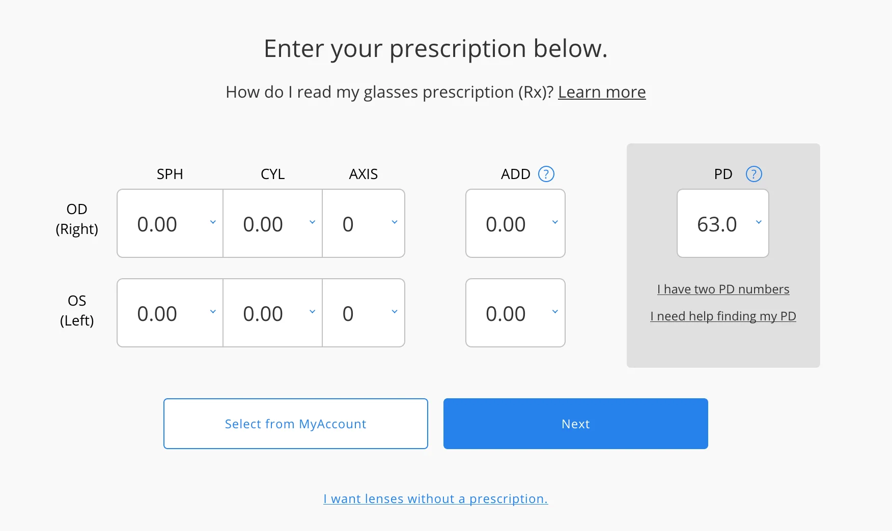
Current design of the prescription view

As I stated, this design isn’t horrible by any means, but right away we can notice some problems:
- the layout causes the users’ eyes to jump between left-to-right and top-to-bottom without good correlation
- title content and
nextbuttons are centered, while dropdowns are presented as left-to-right - anchor link coloring is inconsistent
- too much whitespace between interactive sections
- dropdown height overly large
Starting to make some changes
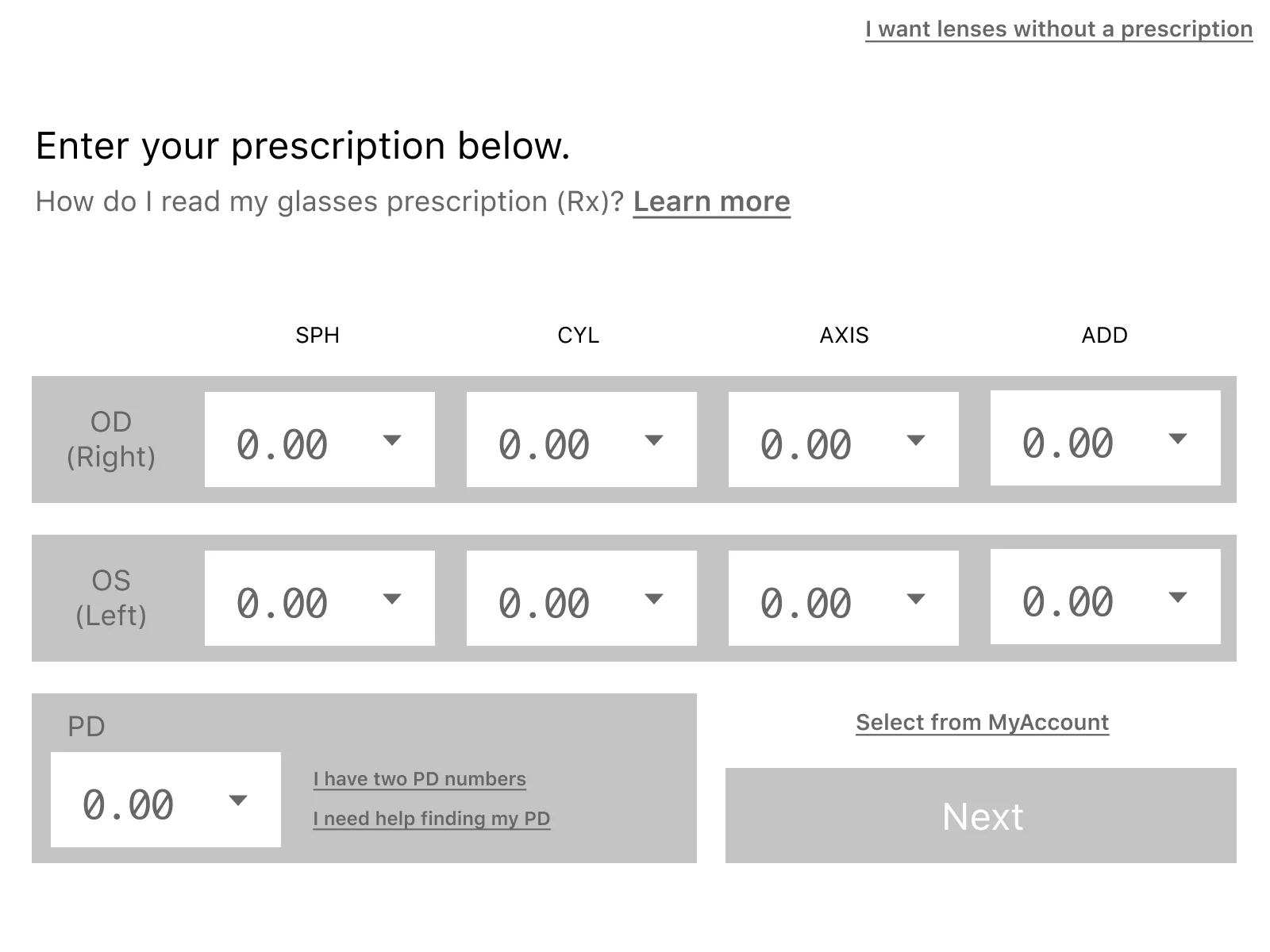
Let’s tackle these problems one at a time. First, we want a more defined page layout so the user can scan through the content more easily (left-to-right, down to the next line, then repeat).

We have now left-aligned the title content to be flush with the OD/OS elements below it to help keep the reading flow consistent.
The previous layout also had the PD in-line with the OD/OS element rows which created a problem of resetting the user thought-process. Since it requires the user to jump from the “right eye” option to the “PD” option, then back to “left eye” option it breaks the flow of user “tasks”. The new UI shifts the PD down into it’s own row, grouping the unrelated tasks on the page separately.
You’ll also notice that I’ve updated the dropdowns to use a
monospacefont to convey that these options are number inputs.
Finally we place the button actions in-line with the PD block since it previously ate up far more real estate than was necessary.
Adding some color
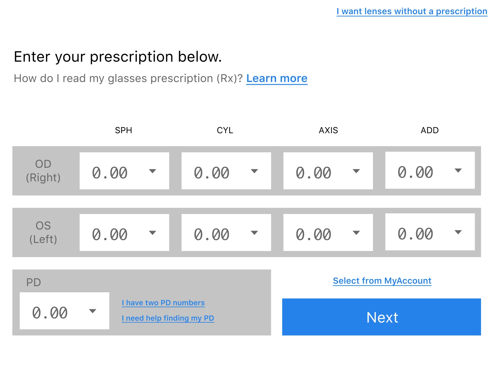
The original design has some inconsistencies with the link coloring - some being a muted grey while others use the accented blue. Updating all interactive links to use Clearly’s default blue accent color would make for a better disconnect from non-interactive elements.

Finishing touches
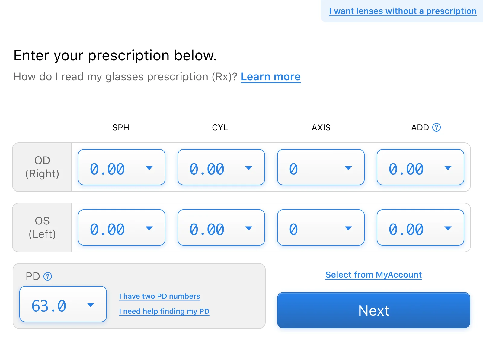
Now that the most important aspects of the refreshed UI are complete (layout, UX flow), we can implement all the visual extras to cleanup our basic wireframe.
- make default select styling include depth and importance (this is the main action of the page afterall)
- round out harsh corner edges on elements
- set labels and row items with more pleasing backgrounds (while still maintaining contrast)
- give the
nextbutton visual importance (make it look like a real button)

That’s it!