Improving Receipt UX
2019-05-15
There was a pretty interesting article posted a couple days ago about rethinking the standard receipt design that I found quite compelling. Although, as good as the concept is, I think it can be improved (simplified) even further.
What was the redesign exaclty?
Overall Susie Lu did a wonderful job tackling such an old and forgotten design. She fixed some major pain points with the current receipt layout:
- Bubble chart to visually indicate total spent per category
- Categorized items by percentage of total spent
- List individual items in descending order based on cost
- Bar charts to compliment the item listing order
Curious how her redesign looks? Take a look at the original article
What did this concept get wrong?
Simply put: paper waste.
Using bubble and bar charts from a visual design perspective is great - but not so eco-friendly in this instance (since we are dealing with physical paper waste). It might seem like a small nitpick but with hundreds of thousands (if not millions) of receipts printed daily, this extra paper space required would add up quickly.
Fortunately, I think with some minor tweaks we can keep the underlying principles of the new redesign, while creating a more eco-friendly layout. We can save more space and therefore save on the overall paper needed.
Receipt Redesign
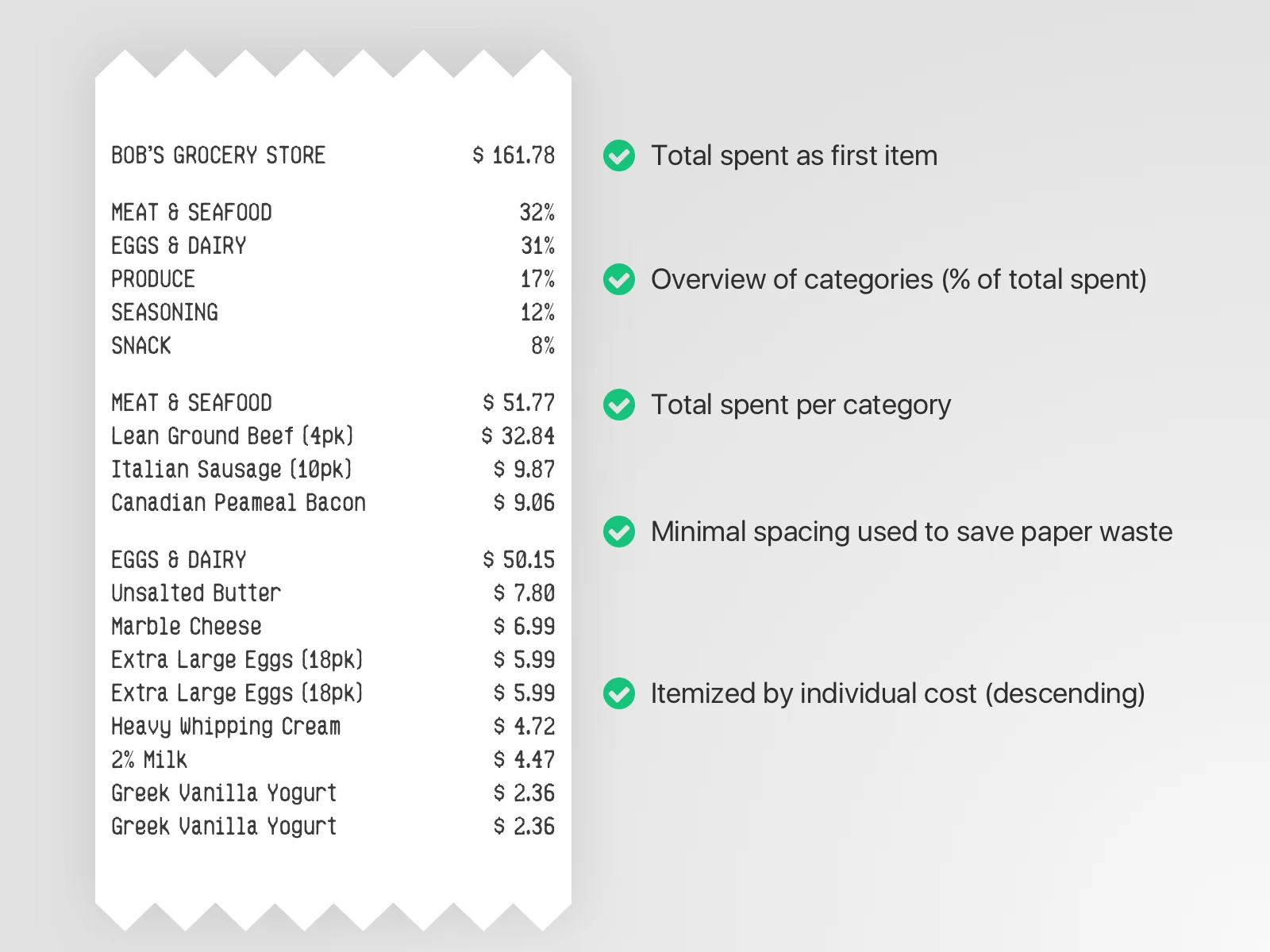
Let’s take a look at my redesign concept:

With this layout we are able to keep all the key concepts that Susie Lu initially introduced with her receipt design while preserving more space.
- Categories are still listed by percentage of total spent
- Individual items are organized in descending order based on cost
- Uppercase and lowercase elements are used to distinguish parent / child items instead of additional space or dividers
Final thoughts
The original redesign from a visual perspective is wonderful but when you start to think about implementing it into the real world, it seems slightly impractical. My redesign concept is far from perfect (I’m sure I’ve overlooked some use cases) but I think it’s a strong step forward for redesigning our archaic receipt layouts.