Mini Interactive Keyboard with Pure CSS
2020-05-13
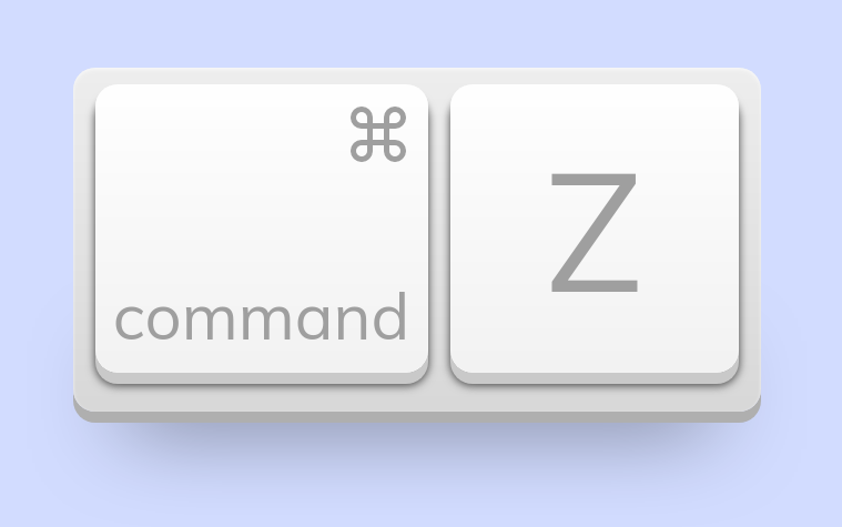
Lately, I’ve become obsessed with trying to see what I can create using only HTML and CSS (besides websites of course). Since playing with the concept of faking 3D elements, I wanted to circle back around to an older CodePen I created: a mini, interactive undo keyboard.
See it in action
Below you can view a live demo of the mini keyboard itself. This demo is nothing special, but takes design inspiration from Apple’s magic keyboards (if that wasn’t already obvious).

So now that we have seen what we plan to build, let’s break down the process of creating this stupid, fun project!
The HTML
The core skeleton of this project is very simple, since the keyboard consists of only 2 interactive buttons on top of a basic base element:
- Keyboard base
- Command button
-
‘Z’ letter button
The CSS
Here is where all the magic happens. Let’s break these elements into their own sections, starting with the base styling:
/* Custom typeface */
@import url("https://fonts.googleapis.com/css?family=Muli");

/* Basic layout styling */
body {
background: #d2dcff;
margin: 80px 0 40px;
}
We then tackle the basic keyboard base element:
.base {
background: linear-gradient(180deg, #eee 0%, #d8d8d8 100%);
border-radius: 20px;
box-shadow: inset 0 3px 5px rgba(255,255,255,0.3), inset 0 1px 3px rgba(255,255,255,0.5), 0 10px 0 #afafaf;
display: flex;
height: 310px;
margin: 0 auto;
position: relative;
width: 620px;
}

/* This pseudo element is used for more realistic drop-shadows */
.base:after {
bottom: 0;
box-shadow: 0 10px 80px rgba(0,0,0,0.5);
content: '';
height: 50px;
left: 7.5%;
position: absolute;
width: 85%;
z-index: -1;
}
Next, we target all shared styles between the 2 keyboard buttons to avoid repeating ourselves later on:
.command, .z {
    -webkit-appearance: none;
    background: linear-gradient(180deg, #fff 0%, #f2f2f2 100%);
    border: 0;
    border-radius: 20px;
    box-shadow: inset 0 1px 3px rgba(255,255,255,0.5), 0 10px 0 #c9c9c9, 0 10px 6px rgba(0,0,0,0.3), 0 12px 8px rgba(0,0,0,0.5);
    cursor: pointer;
    display: inline-block;
    height: 260px;
    margin: 15px 0 0 20px;
    outline: 0;
    position: relative;
    width: 300px;
    z-index: 2;
}

.command span, .z span {
    font-family: 'Muli', 'Helvetica', sans-serif;
}

/* Styling when pressed */
.command:active, .z:active {
    box-shadow: inset 0 10px 10px rgba(0,0,0,0.2), inset 0 10px 30px rgba(0,0,0,0.6), 0 1px 0 rgba(255,255,255,0.6);
    margin: 25px 0 0 20px;
}
All that remains is to add the custom styling for each independent button:
/* Custom Command styling */
.command svg {
    height: 60px;
    right: 15px;
    position: absolute;
    stroke: #9f9f9f;
    top: 15px;
    width: 60px;
}
.command span {
    bottom: 15px;
    color: #9f9f9f;
    font-size: 58px;
    left: 0;
    position: absolute;
    width: 100%;
}

/* Custom "Z" Letter styling */
.z {
    width: 260px;
}
.z span {
    color: #9f9f9f;
    font-size: 150px;
}
Taking it further
You could easily improve upon this concept by rendering an entire interactive keyboard, if you so desired. But this is maybe something I would tackle at a later date when I have a little more free time 😉 For now, a simple mini undo keyboard is fun enough to play with.