Simple Does Not Mean Ugly
2019-03-26
I see new blog posts popping up now and again advocating for designers to keep their products as simple as possible - and I couldn’t agree more.
A lot of designers tend to think they need to reinvent the wheel when it comes to UI concepts that are standard defaults and expected by most users. Not only does this add extra work for your design and development cycles, but also increases the potential of frustration for your users when they are using your product.
Your job as a designer is to focus on the user experience journey and understand what those users expect to happen - not what you want to happen. This is a very delicate balance of design “give and take”, hence why simple designs always seem to work best.
But simple does not mean “ugly”.
Ugly Simple
Anyone who has read some of my opinion pieces on here in regards to UI know that I have a profound distaste for the overused “flat design” trend. Many designers consider this trend a clean and “simple” approach to most UI conventions - which is complete nonsense to most professionals in the industry (at least those not drinking the kool-aid).
Using the term “simple” in the context of UI is currently quite damaging to modern application and product development. Designers take these definitions too literally, leading to stripped down interfaces with little to no usability for their end-users.
Cap Watkins wrote a post back in 2014 where he explained his admiration for boring designers and how they tackled design problems using the most boring or “lazy” techniques. While I don’t agree completely with his arguments, nor do I think one should try to attain the status of “boring designer”, I can understand his main sentiment: everyone can appreciate obvious and clever design.
Fixing Simple
I hate when people point out problems without at least attempting to suggest some sort of solution - which is exactly what I’m going to do here (with only a few set examples of course, otherwise the post would become a book). Let’s take a look at the major culprits I find around the web: navigations, buttons and form elements.
1. Hidden Navigations
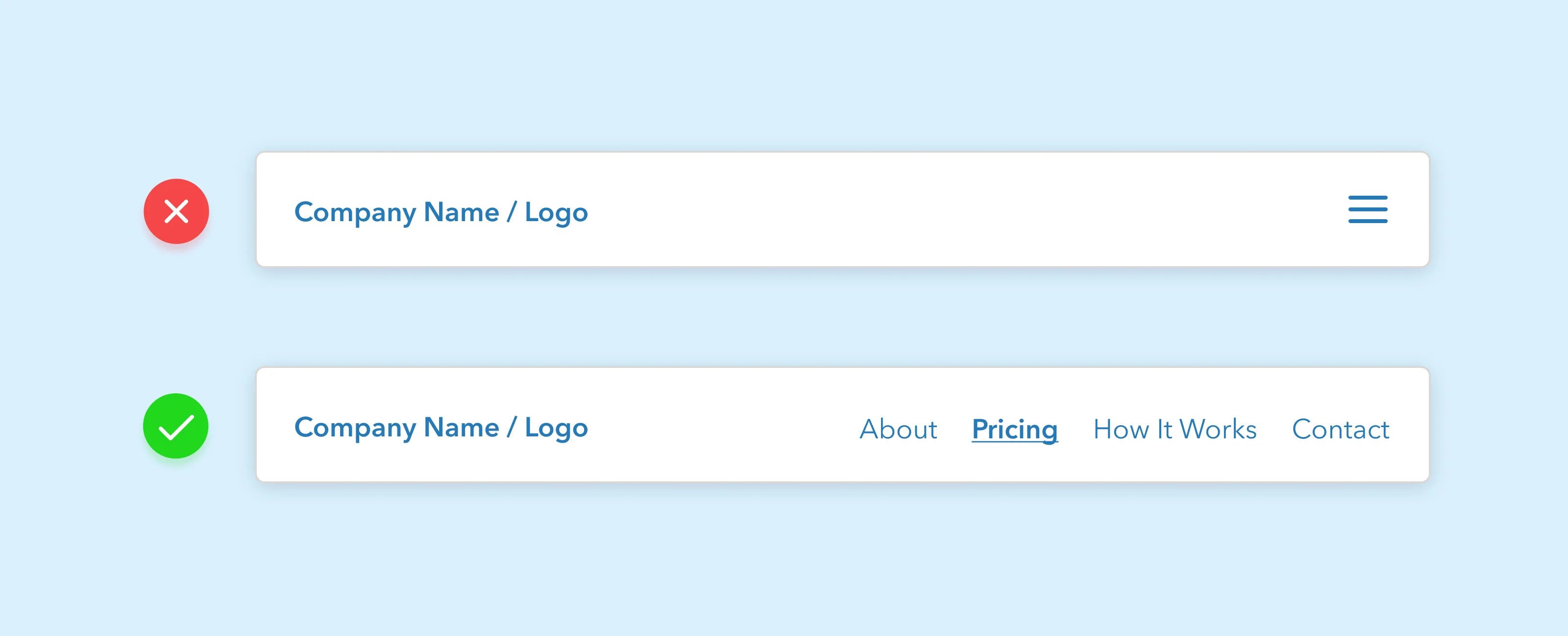
How many native apps that you use regularly rely on the trusty “hamburger” menu icon navigation system? What about news sites, video streaming services, or blogs? Maybe you’ve implemented this concept in your own projects as well, advocating for it’s “cleaner” approach to navigation.
The hamburger is a great example of “ugly simple”. You are purposely hiding the main structure that allows your users to move around your product freely behind an additional interaction. That is the opposite of simple.
The only time you should be using the “hamburger crutch” as I call it, is for very small screen sizes or when targeting mobile user agents directly. That’s it. If your users are viewing your product on a larger screen, for the love of God, use the space available.
2. Buttons Not Looking Like Buttons
It’s difficult for users to actually do the action you want them to perform when your buttons look like text. I’m not exactly sure why designers have pivoted towards removing all stylings that regular users have come to expect from button elements, but it’s plaguing far too many websites.
Buttons should be eye-catching, colorful, fun to interact with, and support all proper CSS states. Clients and agencies will tend to push for “cleaner” buttons - which most of the time refers to setting the buttons as simple underlined text items. Do not be brainwashed into thinking this is better:
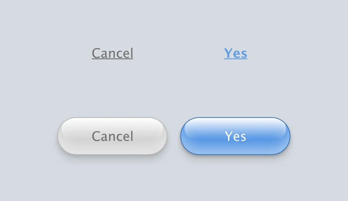
You tell me what looks more interactive…
3. Overriding Form Elements
Designers should rarely rebuild the browser structure for web form elements in their projects. I should clarify - I’m not suggesting that you use the barebones default styles provided by the browser, I’m saying that you shouldn’t hide the elements themselves just to replace them with mimicking components. I find this practice is becoming more and more noticeable with the growing popularity of component-based frameworks. Don’t fall into these bad design habits.
For example, you should leave the following select element as is:
<select>
    <option>
</select>
Instead of doing something like this:
<select style="display:none;"></select>
<div class="custom-select-container">
    <span>Option</span>
</div>
There are cleaner ways to customize web forms with straightforward CSS. Have a look at my own open source project Normform if you’d prefer to just use a lightweight plugin to do this for you. (Shameless plug, I know)
Simple Can Be Good
Having a boring or lazy design thought-process doesn’t mean you should develop ugly UI for the sake of “simple”. Too often that word is associated with “minimalism” or “less content” and that is only half true.
The experience is what needs to be simple for your users - the UI itself should still be beautiful.