Stop Using Sticky Navigation on Mobile
2019-10-06
Stop styling your web elements to be “sticky” on mobile. This creates a horrible experience for your users and also looks like trash from a UI perspective. Don’t style your navigation (or any components for that matter) to be “sticky” on mobile. They create poor experiences for your users and take away valuable screen space.
What do you mean by “sticky”?
The concept of sticky elements include but are not exclusive to:
- Navigations that follow users as they scroll
- Chatbot prompt bubbles eating up half the bottom of the screen
- Banners or modal prompts that pester the user to “sign up, accept cookies” etc.
These are bad and you should feel bad for implementing them. Spacing and layout is a critical part of a product’s design and greatly impacts the experience of its users. Stop screwing it up with ugly sticky elements.
First, let’s breakdown “sticky” navigations and why they’re terrible. We’ll also go over some easy solutions to avoid making these bad design decisions in the first place.
The stalking navigation
When you make a decision to eat away >50px of space at the top of the page for your site’s navigation - you’re hurting your users. You’re also making their time interacting with your website more painful.
“Wait!” I hear sticky-nav defenders exclaim, “this navigation bar makes it so the user can easily interact with the site’s pages!”
What absolute rubbish. A user should only see a website’s navigation when they need to use it. This isn’t rocket science.
Let’s a take a look at the problem:
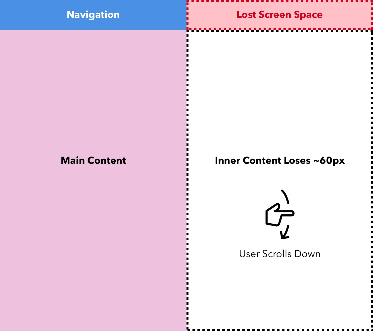
Knowing when to show navigation can be easily solved where the user isn’t bogged down with a chunk of their screen permanently taken away, all the while still having access to the navigation. This can be fixed by simply understanding the user context at a given time. See below:
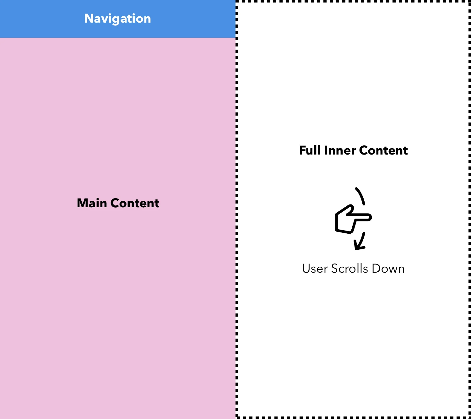
Here the navigation flows up with the rest of the page as the user scrolls the main content into view. Don’t worry about creating confusion - the user knows the navigation is still at the top of the page because they watched it scroll out of view. This is best paired by having a matching navigation in the footer of the page as well. That way, when the user makes it to the end of a specific view they can change pages right in the “footer”. No need to scroll back to the top.
The best of both worlds?
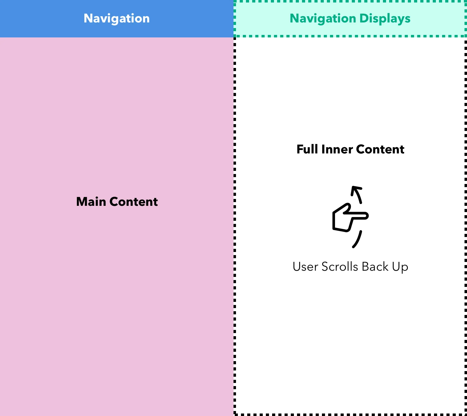
Maybe you want to hide the navigation without losing the flexibility of it always being accessible at the top of the page? This is possible, although I find it still somewhat intrusive on the user. An easy way achieve this is by displaying the navigation when users perform a specific action, such as:
- Long or multiple upward swipes on the page
- Pull down menu from top of current view (easily shown to user)
Navigations aren’t the only culprits
I wish that navigation items were the only sinners of the “sticky” position on mobile - but they are not alone. A few other problematic components include:
- Chatbot or support “bubbles”
- “Agree to our cookies” prompts
- Time-based pop-up modals
Every time you implement one of these components, somewhere in the world a puppy dies. Seriously - don’t be part of the problem and build these things. Push back on “marketing research” or team leads who tell you that this crap works. You’re making the mobile web worse for everyone and setting a terrible precedent for future developers.
Stay static, my friends!