Tabbed Content Without JavaScript
2019-01-28
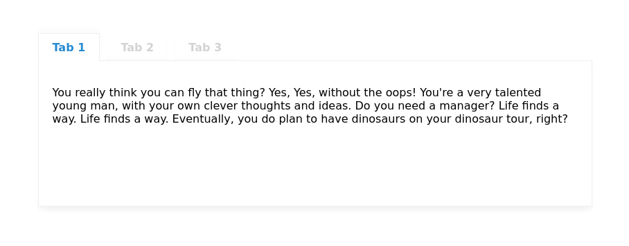
Creating tabs is a fairly trivial and common practice in web design, but many times it requires JavaScript to properly implement. Fortunately it is possible to create tabbed content with only using CSS.

The HTML
The skeleton for this component is fairly basic - we just need the following structure:
- Parent element for each tab item
- Default radio input
- Label linked to corresponding input
-
Inner content associated with each tab item
Content goes here
Full HTML for reference:
<div class="tabs">

    <div class="tab-item">
        <input class="tab-input" type="radio" name="tabs" id="tab-1">
        <label class="tab-label" for="tab-1">Tab 1</label>
        <div class="tab-content">Content goes here</div>
    </div>

    <div class="tab-item">
        <input class="tab-input" type="radio" name="tabs" id="tab-2">
        <label class="tab-label" for="tab-2">Tab 2</label>
        <div class="tab-content">Content goes here</div>
    </div>

    <div class="tab-item">
        <input class="tab-input" type="radio" name="tabs" id="tab-3">
        <label class="tab-label" for="tab-3">Tab 3</label>
        <div class="tab-content">Content goes here</div>
    </div>

</div>
The CSS
First, we need to set each input, label and inner content into their own parent containers:
/* Main parent that holds all contents */
.tabs {
    height: 100%;
    min-height: 250px;
    position: relative;
}

/* Each tab items (includes heading & content) */
.tab-item {
    display: inline;
}
Next, we will hide the default radio input and design our labels to resemble a basic web tab element. The z-index property on the label is important for how we will be stacking our content on the z-axis (labels above inner content for example).
/* Hide the default radio inputs */
.tab-input {
    position: absolute;
    visibility: hidden;
}

/* The main tab headings */
.tab-label {
    background: white;
    box-shadow: inset 0 -4px 4px rgba(0,0,0,0.02);
    color: lightgrey;
    cursor: pointer;
    display: inline-block;
    font-weight: 600;
    margin: 0 5px 0 0;
    padding: 10px 20px;
    position: relative;
    text-align: center;
    z-index: 0;
}
The main inner content of each tab needs to have an absolute position set as it’s default, since the one currently selected will switch to relative on mobile (more on that in a moment):
/* The inner tab content */
.tab-content {
    background: white;
    bottom: 0;
    box-shadow: 0 6px 8px rgba(0,0,0,0.02);
    left: 0;
    overflow: scroll;
    padding: 20px;
    position: absolute;
    right: 0;
    top: 50px;
    z-index: 0;
}
The final step is just telling the browser to style both the label and inner content of the currently selected radio input:
/* Style the currently selected tab label */
.tab-input:checked + .tab-label {
    border: 1px solid #eee;
    border-bottom: 0;
    box-shadow: 0 -6px 8px rgba(0,0,0,0.02);
    color: #268bd2;
    z-index: 2;
}

/* Show the currently selected tab content */
.tab-input:checked ~ .tab-content {
    border: 1px solid #eee;
    z-index: 1;
}
It’s as simple as that! For reference, here is the entire CSS file for easier access:
/* Main parent that holds all contents */
.tabs {
    height: 100%;
    min-height: 250px;
    position: relative;
}

/* Each tab items (includes heading & content) */
.tab-item {
    display: inline;
}

/* Hide the default radio inputs */
.tab-input {
    position: absolute;
    visibility: hidden;
}

/* The main tab headings */
.tab-label {
    background: white;
    box-shadow: inset 0 -4px 4px rgba(0,0,0,0.02);
    color: lightgrey;
    cursor: pointer;
    display: inline-block;
    font-weight: 600;
    margin: 0 5px 0 0;
    padding: 10px 20px;
    position: relative;
    text-align: center;
    z-index: 0;
}

/* The inner tab content */
.tab-content {
    background: white;
    bottom: 0;
    box-shadow: 0 6px 8px rgba(0,0,0,0.02);
    left: 0;
    overflow: scroll;
    padding: 20px;
    position: absolute;
    right: 0;
    top: 50px;
    z-index: 0;
}

/* Style the currently selected tab label */
.tab-input:checked + .tab-label {
    border: 1px solid #eee;
    border-bottom: 0;
    box-shadow: 0 -6px 8px rgba(0,0,0,0.02);
    color: #268bd2;
    z-index: 2;
}

/* Show the currently selected tab content */
.tab-input:checked ~ .tab-content {
    border: 1px solid #eee;
    z-index: 1;
}
Don’t forget about mobile
With only a few extra lines of CSS we can ensure that our custom tabs will stack on top of each other and look solid on mobile devices:
@media(max-width:38em) {
    .tab-label {
        display: block;
        width: 100%;
    }
    .tab-content {
        display: none;
    }
    .tab-input:checked ~ .tab-content {
        bottom: auto;
        display: block;
        position: relative;
        top: auto;
    }
}
One minor caveat
Even though I’m a pretty big fan of implementing tabs this way, there is a small drawback:
The height of the inner content doesn’t grow dynamically since it defaults as absolute, so a min-height or height value is required on the parent element. This could become a problem in certain situations where you don’t have the luxury of setting a static height.
Other than that, enjoy building some JavaScript-free tabs!