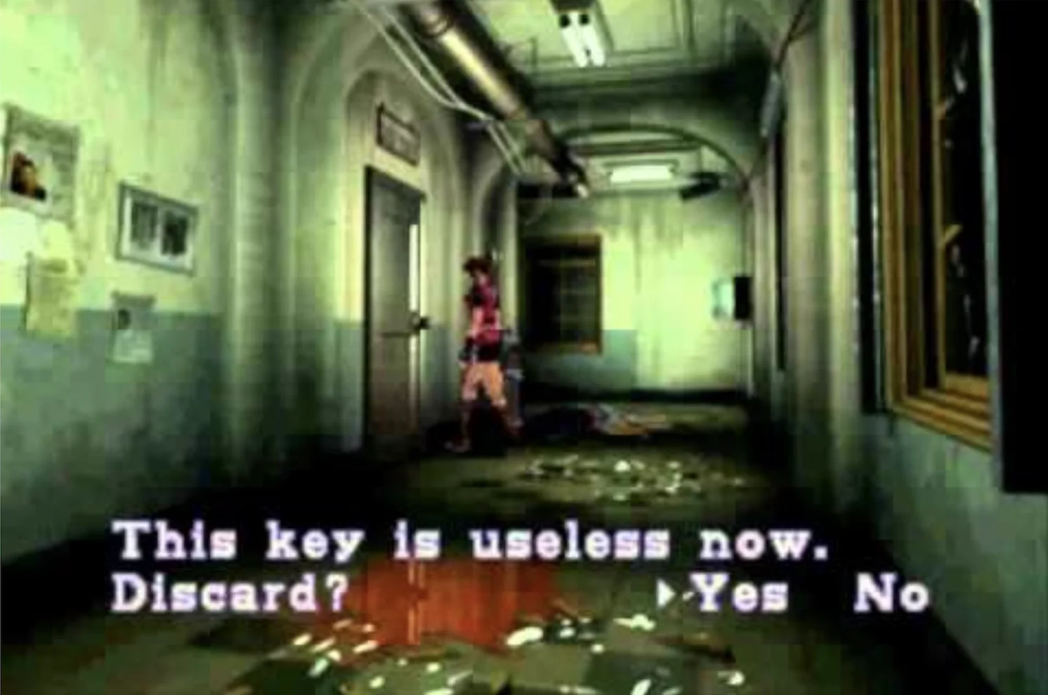
“This Key is Useless Now. Discard?”
2024-08-28
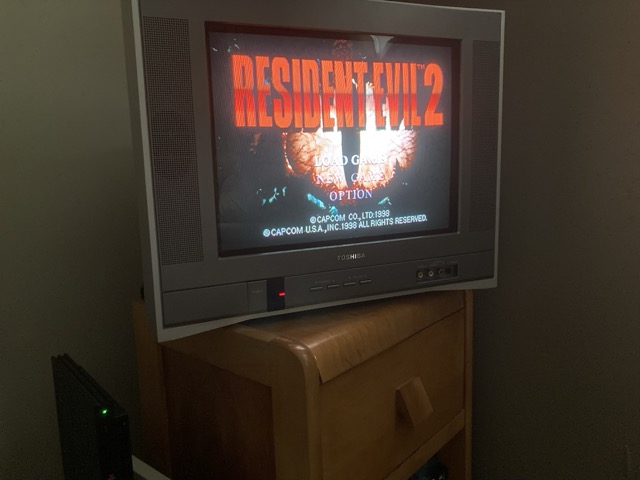
The title of this article probably triggers nostalgic memories for old school Resident Evil veterans like myself. My personal favourite in the series (not that anyone asked) was the original, 1998 version of Resident Evil 2 (RE2). I believe that game stands the test of time and is very close to a masterpiece. The recent remake lost a lot of the charm and nuance that made the original so great, which is why I consistently fire up the PS1 version on my PS2 Slim.
But the point of this post isn’t to gush over RE2. Instead I would like to discuss how well RE2 handled its interface and user experience across multiple in-game systems.
HUD? What HUD?
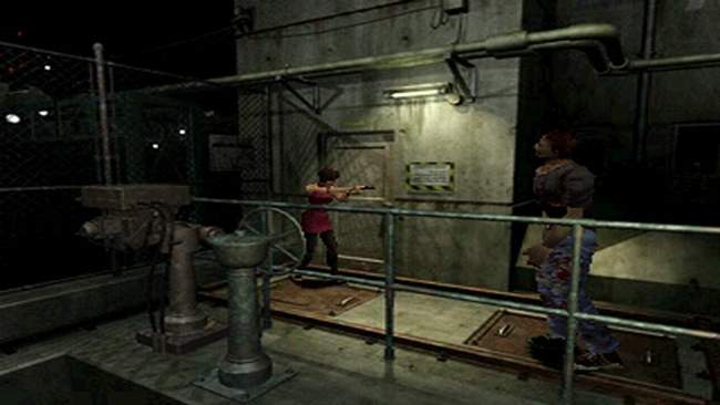
Just like the first Resident Evil that came before it, RE2 has no in-game HUD (heads-up display) to speak of. It’s just your playable character and the environment. No ammo-counters. No health bars. No “quest” markers. Nothing.
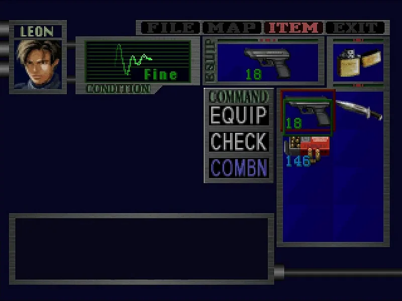
The game does provide you with an inventory system, which holds your core items, weapons and notes you find along your journey. Opening up this sub-menu allows you to heal, reload weapons, combine objects or puzzle items, or read through previously collected documents. Not only is this more immersive (HUDs don’t exist for us in the real world, we need to look through our packs as well…) it also gets out of the way.
I don’t need a visual element in the bottom corner showing me a list of “items” I can cycle through. I don’t want an ammo counter cluttering up my screen with information I only need to see in combat or while manually reloading. If those are pieces of information I need, I’ll explicitly open and look for it. Don’t make assumptions about what is important to me on screen.
Capcom took this concept of less visual clutter even further in regards to maps and the character health status.
Where We’re Going, We Don’t Need Roads Mini-Maps
A great deal of newer games come pre-packaged with a mini-map on the main interface. In certain instances this works just fine, but most are 100% UI clutter. Something to add to the screen. I can only assume some devs believe it is “helpful”. Most times it’s simply a distraction. Thank goodness most games allow you to disable them.
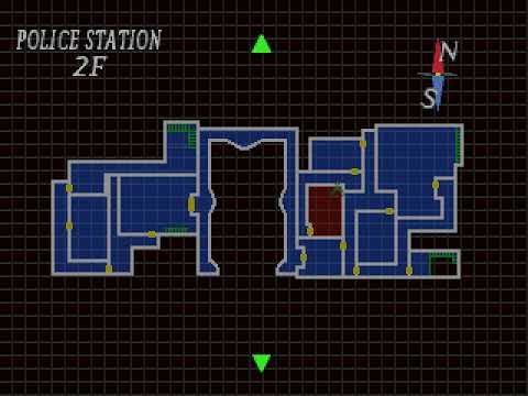
As for RE2, you collect maps throughout your adventure and, just like most other systems in the game, you need to consciously open the map menu to view them. You know, just like in real life. This creates a higher tension as well, since you need to constantly reference your map (on initial playthroughs) to figure out where the heck to go. You feel the pressure of someone frantically pulling out a physical map and scanning their surroundings. It also helps the player build a mental model in their head, thus providing even more of that sweet, sweet immersion.
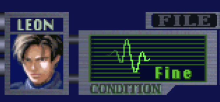
No Pain, No Gain
The game doesn’t display any health bar or player status information. In order to view your current status (symbolized by “Fine”, “Caution” or “Danger”) you need to open your inventory screen. From here you can heal yourself (if needed) and see the status type change in real-time.
But that isn’t the only way to visually see your current status.
Here’s a scenario: you’re traveling down a hallway, turn a corner and run right into the arms of a zombie. She takes a couple good bites out of your neck before you push her aside. You unload some handgun rounds into her and down she goes. As you run over her body she reaches out and chomps on your leg as a final “goodbye”. You break free and move along but notice something different in your character’s movement - they’re holding their stomach and limping.
If this was your first time playing, most players would instinctively open the inventory menu, where their characters health is displayed, and (in this instance) be greeted with a “Caution” status. This is another example of subtle UX design. I don’t need to know the health status of my character until an action is required (in this example: healing). The health system is out of the way but not hidden. This keeps the focus on immersion, not baby-sitting the game’s interface.
A Key to Every Lock
Hey! This section is in reference to the title of the article. We made it!
…But yes, discarding keys in RE2 is a subtle example of fantastic user experience. As a player, I know for certain this key is no longer needed. I can safely discard it and free up precious space from my inventory. There is also a sense of accomplishment, a feeling of “I’ve completed a task” or an internal checkbox being ticked. Progress has been made!
Don’t overlook how powerful of a interaction this little text prompt is. Ask any veteran of the series and they will tell you this prompt is almost euphoric.
Inspiring Greatness
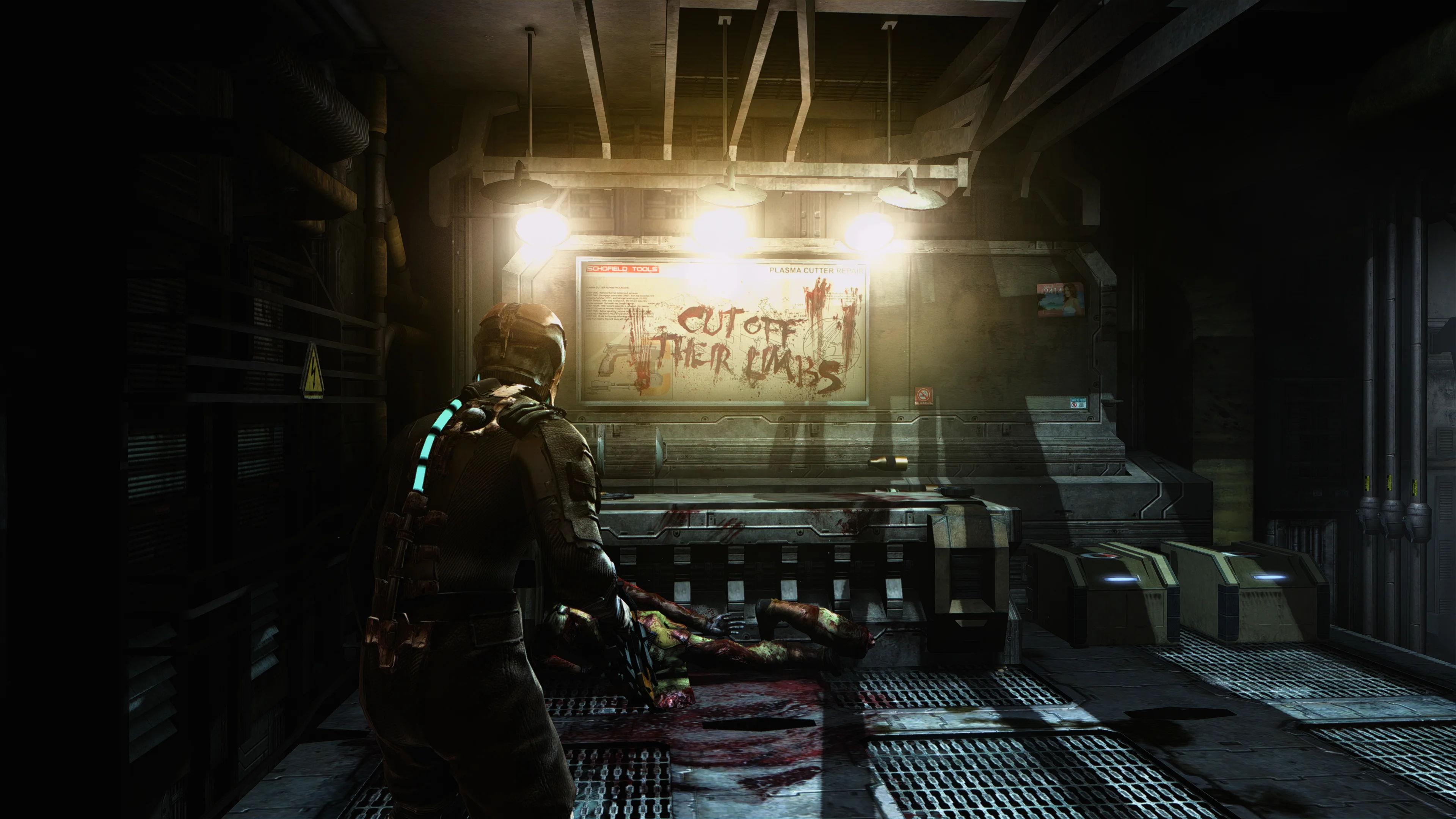
RE2 is certainly not the first or last game to implement these “minimal” game systems. A more “modern” example is Dead Space (DS), along with its very faithful remake. In DS the character’s health is displayed directly on the character model itself, and a similar inventory screen is used to manage items. An ammo-counter is visible but only when the player aims their weapon. Pretty great stuff and another masterpiece of survival horror.
The Point
I guess my main takeaway is that designers and developers should try their best to keep user experience intuitive. I know that sounds extremely generic but it is a lot more complex than one might think. Try to be as direct as possible while remaining subtle. It’s a delicate balance but experiences like RE2 show us it is attainable.
I’d love to talk more, but I have another play-through of RE2 to complete…